Watch the Video
The Original Doom Pre-Release Alpha and Betas, worked on by John Romero and John Carmack before Doom’s original release in 1993. These demos are unmistakably Doom from the off, but there are various quirks and changes which were added and removed along the way, including the weapons, pickups, levels, gameplay and a whole lot more. Join me as I explore the maps on these Doom Alpha and Beta versions.
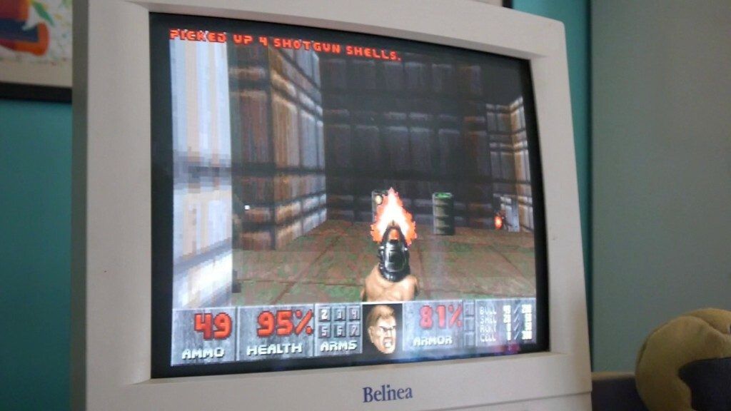
It’s 2016, and Doom 4 is being played by those prosperous enough to have a competent PC. However, for everyone else, there’s still the original DOOM, and DOOM takes some serious beating.
Released in 1993, Doom was the game the world had been waiting for. Developed by id software, lead by John Romero and Carmack, it was probably the natural successor to Wolfenstein 3D, but the evolution created a game which was more than the sum of it’s parts. A game which propelled the 3D genre into a new arena, jumping from the Ray-casting technique of id’s previous games and moving into the simulated 3D technique of Binary Space partitioning.
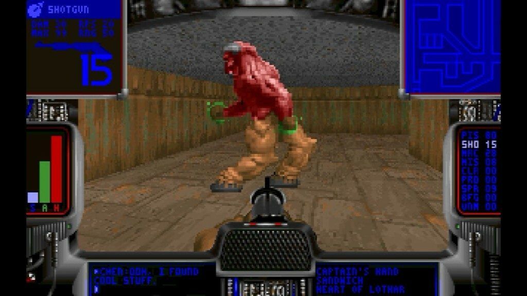
With any leap of development comes a development process and it’s here that we begin with the alpha versions of Doom, specifically with version 0.2, and even though a lot is different, it’s still unmistakably Doom, even at this early stage. There are no sound effects for any of the alpha or beta versions, but what we do have are many of the attributes and features we associate with the final game.
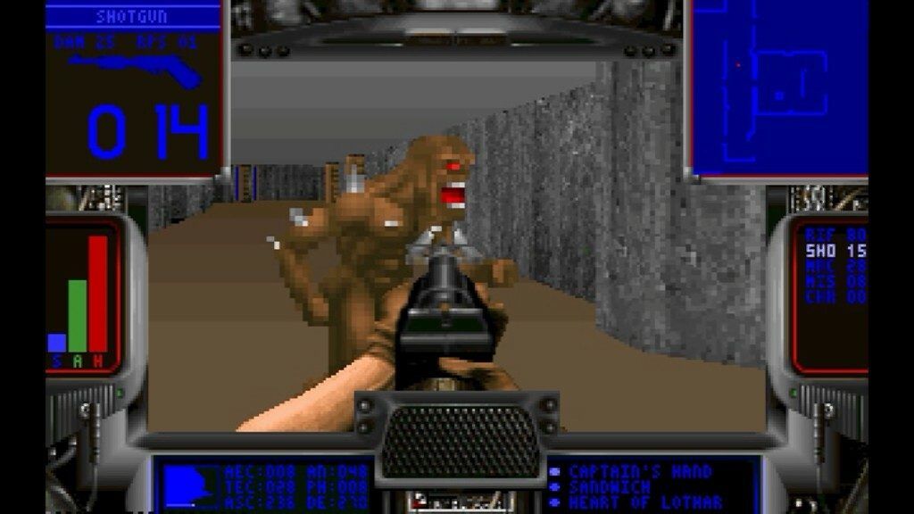
Version 0.2 is a small demonstration, featuring some non clipping enemy sprites, although they are already rotating in their pseudo 3D style. You’ll notice a large wrap around HUD, in the style of the Doom helmet, featuring some messages at the bottom from fellow marines – in this case Chen – and a static map. These presumably helped the game run on lower end 386 systems, but ultimately gave the game less of impact that we’d associate with the full screen aspect.
Version 0.3 gives us a new menu system, new levels to go with it, and with these new levels we find new textures, although they mainly provide a stony, metallic feel to the Martian base. Options have been added allowing us to change detail levels between low, medium and high. We’ve also go the initial workings of the auto-map with the HUD’s in built map.
We’ve also got some rudimentary platform undulation, demonstrating the key feature of the new engine.
Although monsters are moving, they can’t be clipped or shot at this stage. You’ll also notice a variety of weapons, some which are changed completely in the final game… Rather than bare knuckles or a chainsaw, Doom Guy seems to have a cattle prod at this stage. We also have a semi-familiar looking shotgun, a rifle and a machine type gun.
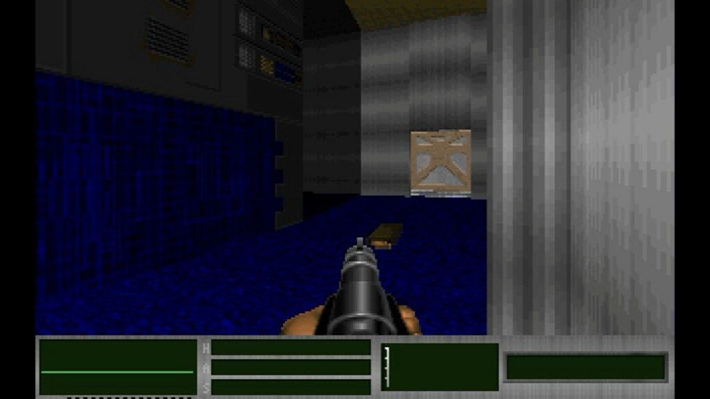
The large HUD can be reduced to the familiar lower bar in this release, albeit without Doom guy’s little face to connect us to our protagonist, and in….
…Version 0.4, it’s removed entirely. Things really start to ramp up in this version. You’ll notice that we keep beginning levels surrounded by fellow marines. That’s because the original game plot was to involve a team of marines, rather than just the single Doom Guy protagonist. The weapons are also evolving, and the rifle to me, looks more like the shotgun from Quake at this point.
Now, these levels are probably starting to look familiar to you, although the texture mapping lends itself to more terrestrial looking locations. They feel more like the lab locations we find in the Doom movie, including sterile areas, laid out in a more conventional arrangement – given Doom’s limitations at least – and some levels even harbour locker rooms with showers brimming with naked monsters.
We’ve also got stairs… which although seemingly fairly obvious and mundane now, were a huge evolutionary leap back then. Because Doom uses a fake 3D technique, where everything is actually on the same plane, but calculated to appear like it’s on different levels (hence the reason you can’t have rooms above other rooms), we still find limitations around level design here, including the inability to fall off areas raised higher than a stair’s height.
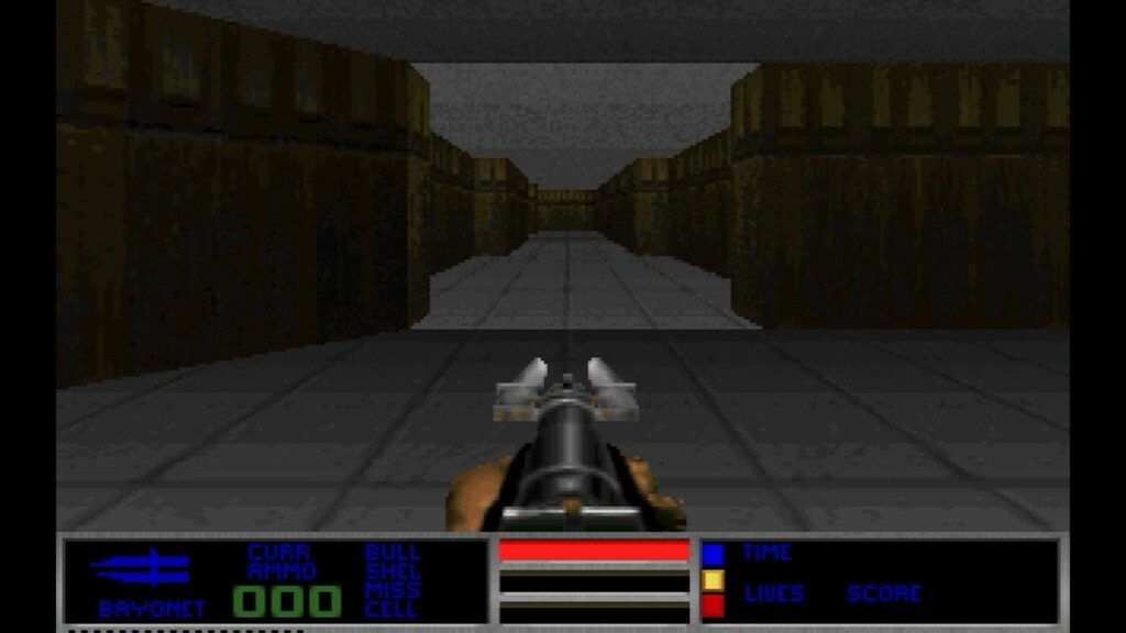
Version 0.5 brings us a more familiar menu system, and more information on our lower status bar, including mention of a bayonet… I guess that’s what the cattle prod is meant to be, and although we can now shoot things – well, they disappear at least, even the medi-kits – we still can’t use the bayonet to good measure. One thing you may notice is that these early levels are a lot more sprawling and massive than the end games faster, shorter pace. There are levels here with huge rooms and massively long, dark corridors, which are actually pretty cool. We’ve also got the familiar Doom scare tactics, with invisible switches and ambient lighting left right and centre. Many of the levels in these early demos would go on to form the basis of levels in the released version of Doom. and although the final Doom levels are great, I kinda pine for some of these massive levels… it just adds a degree of expanse, depth and exploration. To me it feels more like a sprawling Mars base – or how I imagine one – connected by deep corridors, and stocked with huge warehouses of supplies.
You might also notice that the pacing is slightly different at this stage. Everything is a little slower, and Doom Guy runs with a swagger that wouldn’t be out of place in a West End Musical.
We also have collectables… a spill over from the Wolfenstein games, which were omitted from Doom’s public release, as it was deemed that the blood thirsty killing was reward enough. Doom guy isn’t the type to wander round picking up artefacts. Leave that shit to Lara Croft, there’s killing to be done.
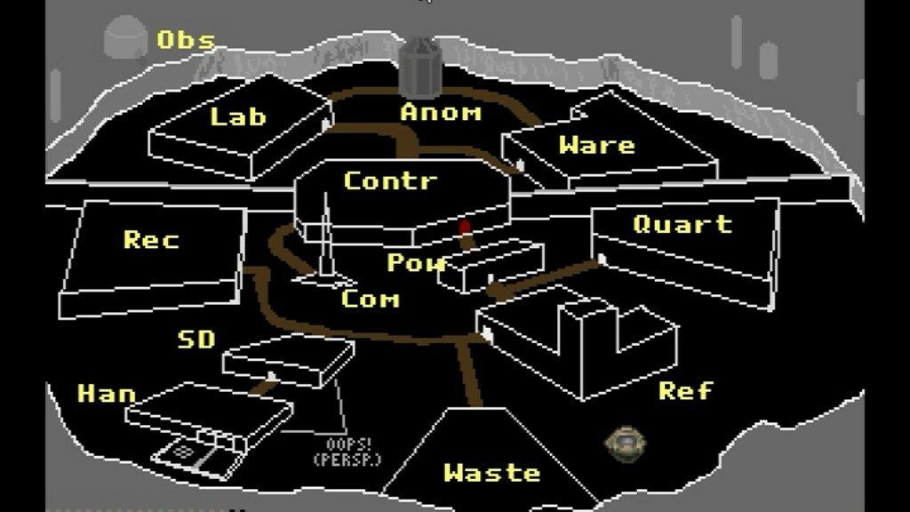
Ending a level now provides you with a wire-frame model of the base, and Doom Guy’s head to indicate your current location.
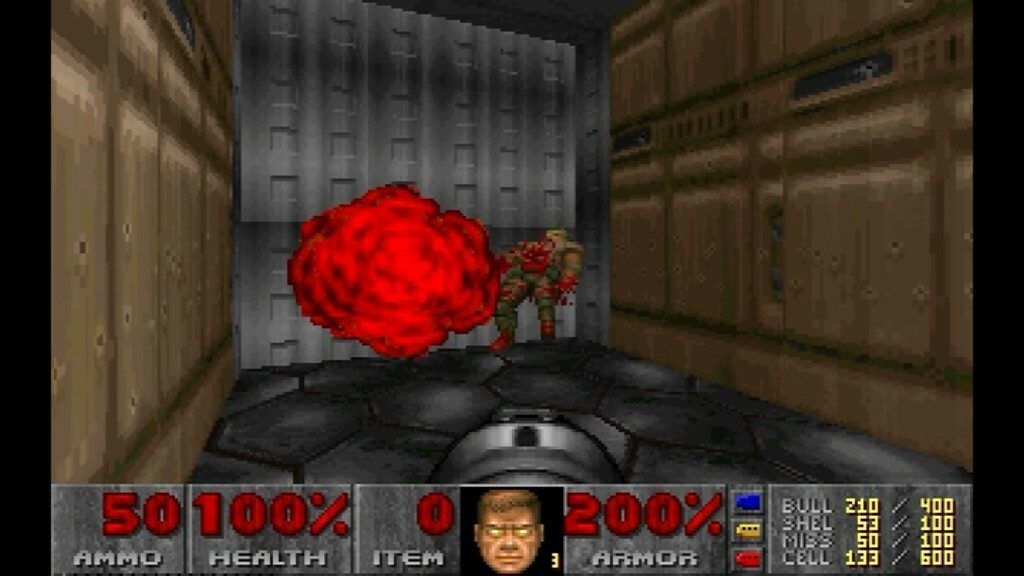
From there we move straight to the pre-release Beta, complete with 3 demonstration levels and Doom Guy’s face, present and correct. This is the version shipped out for press release purposes, and it’s pretty close to the end game. This is clearly E1M2, but it’s not quite the version we know and love just yet. Instead of stairs, we have lifts – and slow lifts at that – instead of rooms, we have swampy corridors and instead of a BFG we have a fucking awesome BFG which I bloody love! Look at this thing! Rather than firing a single shot, this just eradicates anything in it’s path with a folly of plasma shots. The standard plasma gun is unchanged, albeit for some different coloured projectiles and the other weapons are the same, although they feel just a tad more vicious to me.
We’ve also got windows now, and I quite like the Martian landscape in this release… darker, more sinister, more Doomy.
Cheats are also included, allowing you to walk through walls, activate god mode and expose the entire level map on a whim.
And that leads us back into more familiar territory with the original shareware release of Doom, version 1.0, which would be refined and updated with various releases, culminating in version 1.9 of Ultimate Doom released in 1995, and featuring the fourth episode, Thy Flesh Consumed.
Although these early alpha versions are pretty irrelevant to the end user, there’s something about looking back at production, about peering into the mind-scape of the id team, and following the design of one of mankind’s greatest achievements that I find utterly compelling. I feel more connected with Doom, I feel more at peace with Doom, and understanding the creative genius and work that went into Doom makes me appreciate it just that little bit more.
Now, if I could just get a PC capable of running Doom 4…

Nostalgia Nerd is also known by the name Peter Leigh. They routinely make YouTube videos and then publish the scripts to those videos here. You can follow Nostalgia Nerd using the social links below.

